
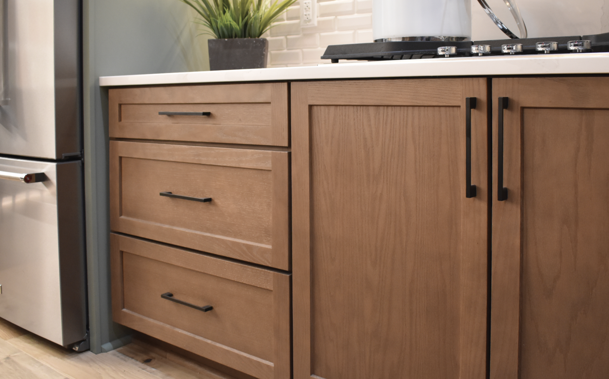
You’ve picked a few cabinet samples you love. You’ve fallen for at least three countertop slabs. But when you lay them next to each other on your kitchen table, nothing feels quite right. That’s the moment many homeowners in the Denver Metro area call us: “How do I make these pieces actually work together in my home?”
Pairing cabinet colors and countertops isn’t about memorizing rules; it’s about understanding how light, undertones, and daily life come together in your space.
Start With the Mood, Not the Material
Before you think in terms of white vs. wood or quartz vs. granite, decide how you want the room to feel. Bright and airy? Cozy and grounded? Quietly minimal? That mood will guide every color decision.
For example, a light cabinet with a soft, patterned quartz reads open and calm, while a stained wood paired with a dark stone feels intimate and dramatic. In our kitchen remodel projects, we often begin with three words you’d like the room to evoke—like “fresh, welcoming, simple”—and hold every cabinet and countertop choice against that filter.
Key idea: define the feeling first; let colors and finishes serve it.
Read the Light and the Colorado Climate
Front Range homes live with strong sun, low humidity, and real temperature swings. Those realities affect how your cabinets and countertops will look and last.
South- and west-facing kitchens in places like Centennial or Aurora get intense afternoon light that can wash out very pale cabinets and exaggerate veining in stone. In those rooms, slightly warmer, mid-tone cabinets with a gently patterned surface often age more gracefully than stark white paired with high-contrast countertops. You can see how different combinations behave under real lighting in our project gallery, where each completed remodel balances color with natural light.
Low humidity also matters for wood. Stained or painted doors will expand and contract a bit over time, so we look for finishes and construction methods from our featured cabinet brands that are engineered for stability in Colorado’s dry air.
Key idea: evaluate samples in your actual light at different times of day, not just under showroom bulbs.
Match Undertones, Then Play With Contrast
Most “this doesn’t feel right” reactions come from clashing undertones, not from the colors themselves. A cool, blue-leaning white cabinet next to a creamy, yellow-based quartz will always feel slightly off, even if both are “light neutrals.”
When we pair cabinets with surfaces from the featured countertop brands we carry, we start by matching undertones: cool with cool, warm with warm, or intentionally neutral with either. Once those are in harmony, you can safely introduce contrast:
- Light cabinets with a deeper, textured countertop for definition
- Rich wood with a lighter stone to keep the room from feeling heavy
- Soft mid-tone cabinets with a subtly veined surface for a quiet, modern look
If your home in Castle Rock has an open-concept plan, think about how these contrasts will read from the adjacent living or dining room. You want a visual “conversation” between spaces, not a hard stop.
Key idea: undertone harmony first, contrast second.
Balance Practicality and Personality
Every kitchen or bath has its own wear-and-tear story. A busy family in Parker with kids and pets needs a different level of forgiveness than a minimal household that cooks occasionally.
Lighter countertops can hide crumbs and water spots but may show stains more quickly if not sealed or cared for properly. Dark, solid surfaces can reveal every speck of dust yet feel wonderfully sleek. Similarly, flat-panel dark cabinets look stunning but show fingerprints more than a soft white shaker.
In a full bathroom remodel, for instance, we might pair a wood-look vanity with a light, low-contrast top to disguise hard water spots from daily use, while reserving bolder stone patterns for accent niches or shelves. Once you’ve settled on a combination that fits your lifestyle, our crew follows a five-step installation process to make sure those choices are installed with tight reveals and clean seams, so the pairings look intentional, not improvised.
Key idea: let maintenance realities fine-tune which shade and pattern you choose, not dictate the entire design.
Bringing It All Together in Your Home
When cabinets and countertops work together, the room stops feeling like a collection of parts and starts feeling like your home. You don’t have to solve the puzzle alone. Our in-house designers listen first—to how you live, how Colorado light moves through your rooms, and what you’re drawn to—then help you test combinations until the pairing feels effortless.
If you’re ready to see how the right colors and materials could transform your kitchen or bath, schedule your in-home consultation and we’ll bring samples, ideas, and a designer’s eye to your space.